
After my second post on predicting video game review scores, I realized how easy it is to find or even collect data on the Internet (if you have the right tools and know where to look, of course!). As a former researcher trained in experimental psychology, I used to spend weeks recruiting people willing to participate in my experiments, which was time consuming and did not make it easy to collect large amounts of data. When working on data science projects, relying on data available online makes things really easy. As a metal fan, I was curious to learn about the evolution metal genres over time, their distribution by country,… However, I didn’t find any database with the relevant information. I thus decided to create one by myself using web scrapping techniques and the website Spirit of Metal. I know, it’s about music and metal again, but I promise you that this was just an excuse to play with visualization tools that I never used before. So this post is more about exploring new way of making cool visualizations than metal (but I had the hope to learn a little about evolution of metal genres!).
The data
I always prefer to work with real datasets, and even more data I collected myself. For this post, I wanted to explore new visualizations with a dataset of metal bands around the world. While I won’t use and analyse metal bands name in this post, be aware that if you’re planning to use this dataset, band names may contain explicit content.
In this post I explored four different visualizations: bump chart plotting ranks over time, map, interactive figure, and animated plot. Here below is the list of packages I used to create the visualizations. The package ggbump was used for the bump chart, sf, giscoR, and eurostat packages were required for the map, I used ggflags and ggiraph packages for the interactive plot, and the packages gganimate, elementalist, ggshadow, and ggimage were needed for the animated bar plot.
I have also created a custom_palette with the cols4all package that I used for the bump chart. Finally, you’re interested in reproducing the the visualizations in this post, you’ll need some custom functions and additional fonts.
Show the code with required packages and custom functions
# meta-color package [not on CRAN, use
# remotes::install_github("mtennekes/cols4all")]
library(cols4all)
# data science oriented collection of packages
library(tidyverse)
# provide functions for time/date manipulation
library(lubridate)
# package providing nice geom to create bump plot
library(ggbump)
# provide simple features access, here used for geometrical operations
library(sf)
# API package helping to retrieve data from Eurostat - GISCO
library(giscoR)
# provide tools to access Eurostat database
library(eurostat)
# provide the option to use country flags as geom in ggplot [Not on CRAN,
# use devtools::install_github("jimjam-slam/ggflags") to install the package]
library(ggflags)
# provide functions to create interactive plots
library(ggiraph)
# provide functions to create animated plots
library(gganimate)
# package to load fonts into R
library(sysfonts)
library(showtext)
# provide functions to make "glowing" geom in ggplot
library(ggshadow)
# provide function to create rounded panel background in ggplot [Not on CRAN,
# use devtools::install_github("teunbrand/elementalist") to install the package]
library(elementalist)
# provide the possibility to add images in ggplot
library(ggimage)
# library(patchwork)
# library(grid)
# package making easy working with relative path
library(here)

# Custom palette used in the the bump chart on metal styles ranking
custom_palette <- c4a(palette = "tol.rainbow", type = "cat", n = 14)[-1]

# Add fonts to be used in plots
font_add("Century Gothic", "GOTHIC.TTF")
font_add("Bauhaus 93", "BAUHS93.TTF")
font_add_google("Bungee Inline")
font_add_google("Wallpoet")

# Custom functions to make "equalizer" bar plots and gradient color background
source(here("posts", "metal_viz", "functions", "metal_equalizer.R"))
# Function producing color gradient objects (adapted from Kamil Slowikowski:
# https://stackoverflow.com/a/54557456)
source(here("posts", "metal_viz", "functions", "make_gradient.R"))
# Custom function used to add columns to the metal bands data whether bands were
# active during consecutive periods of n-years.
source(here("posts", "metal_viz", "functions", "initiate_years_col.R"))
Let’s start by loading the dataset. As mentioned above, it was created using web scrapping, but I won’t go into the details of how that was done here. If you are interested in the process, feel free to check out the repository containing the code I used to web scrape. The dataset contains information about metal bands retrieved from Spirit of Metal. Also, since I used this dataset in conjunction with data from Eurostat and the World Bank, I added variables with country names that match the convention of these additional data sources.
Here is a table with the different variables in the dataset:
Show the code to load and prepare the data
# Load and format the metal database
dat <-
  read_csv2(
    "https://raw.githubusercontent.com/gorinsimon/metal_band_database/main/data/metal_band_database_clean_2022-03-31.csv",
    col_types =
      cols(
        .default = col_character(),
        status = col_factor(),
        separation = col_integer(),
        popularity = col_integer(),
        fans = col_integer()
      )
  ) |>
  mutate(
    # Parse the 'formation' variable to transform values set as 'Unknown' to NA
    formation = parse_number(x = formation, na = c("", "NA", "Unknown")),
    # Compute the last year of activity of the bands. As the database was
    # created while 2022 was not over yet, last year of activity is set to 2021
    # for bands still active.
    last_activity = if_else(is.na(separation), 2021L, separation),
    # Compute bands activity period (time interval between formation and last
    # activity dates).
    activity_period =
      interval(
        as_date(
          if_else(
            is.na(formation),
            NA_character_,
            paste0(formation, "-01-01")
          )
        ),
        as_date(
          if_else(
            is.na(formation),
            NA_character_,
            paste0(last_activity, "-01-01")
          )
        )
      ),
    # Clean the country of origins of the bands so it is using the same
    # convention as in the data from Eurostat that are used later.
    country =
      case_when(
        country == "USA" ~ "United States",
        country == "Russia" ~ "Russian Federation",
        country == "Republic of Serbia" ~ "Serbia",
        country == "United-Kingdom" ~ "United Kingdom",
        country == "South-Africa" ~ "South Africa",
        country == "South-Korea" ~ "Korea",
        country == "Costa-Rica" ~ "Costa Rica",
        country == "Serbia" ~ "Serbia",
        country == "Puerto-Rico" ~ "Puerto Rico",
        country == "New-Zealand" ~ "New Zealand",
        country == "Panamá" ~ "Panama",
        country == "Sri-Lanka" ~ "Sri Lanka",
        country == "Trinidad-and-Tobago" ~ "Trinidad and Tobago",
        country == "Trinidad & Tobago" ~ "Trinidad and Tobago",
        country == "Dominican-Republic" ~ "Dominican Rep.",
        country == "Bosnia & Herzegovina" ~ "Bosnia and Herzegovina",
        country == "United-Arab-Emirates" ~ "United Arab Emirates",
        country == "Saudi-Arabia" ~ "Saudi Arabia",
        country == "San-Marino" ~ "San Marino",
        country == "Tadjikistan" ~ "Tajikistan",
        country == "Viêt-Nam" ~ "Vietnam",
        country == "Timor Leste" ~ "Timor-Leste",
        country == "North-Korea" ~ "Dem. Rep. Korea",
        country == "North Korea" ~ "Dem. Rep. Korea",
        country == "Myanmar (Burma)" ~ "Myanmar/Burma",
        TRUE ~ country
      ),
    # Clean the country of origins of the bands so it is using the same
    # convention as in the dataset from the World Bank that are used later.
    country_wb =
      case_when(
        country == "Czechia" ~ "Czech Republic",
        country == "Iran" ~ "Iran, Islamic Rep.",
        country == "South Korea" ~ "Korea, Rep.",
        country == "Turkey" ~ "Turkiye",
        country == "Venezuela" ~ "Venezuela, RB",
        country == "Slovakia" ~ "Slovak Republic",
        country == "Syria" ~ "Syrian Arab Republic",
        country == "Egypt" ~ "Egypt, Arab Rep.",
        country == "Myanmar/Burma" ~ "Myanmar",
        country == "Brunei" ~ "Brunei Darussalam",
        country == "Laos" ~ "Lao PDR",
        country == "Kyrgyzstan" ~ "Kyrgyz Republic",
        country == "Dem. Rep. Korea" ~ "Korea, Dem. People's Rep.",
        TRUE ~ country
      )
  ) |>
  relocate(country_wb, .after = country)

tibble(
  variable = colnames(dat),
  type =
    c(
      "character", "character", "character", "character",
      "factor", "numeric (year)", "numeric (year)", "character","character",
      "character", "numeric", "numeric", "numeric (year)", "interval"
    ),
  description =
    c(
      "Unique band identifier",
      "The name of the band",
      "The alias of the band (if any)",
      "The style of the band",
      "Status of the band",
      "The year of formation of the band",
      "The year of separation of the band",
      "The country the band comes from (Eurostat format)",
      "The country the band comes from (World Bank format)",
      "The city the band comes from",
      "Number of stars ou of five the band has on Spirit of Metal",
      "The number of people who liked the band on Spirit of Metal",
      "The year the band split up (or 2022 if still active)",
      "The period of activity of the band"
    ),
  levels =
    map(
      colnames(dat),
      ~ if(is.factor(dat[[.x]])) {levels(dat[[.x]])} else {NA}
    )
) |>
  knitr::kable() |>
  kableExtra::kable_styling(
    full_width = FALSE,
    bootstrap_options = "striped"
)| variable | type | description | levels |
|---|---|---|---|
| id | character | Unique band identifier | NA |
| name | character | The name of the band | NA |
| alias | character | The alias of the band (if any) | NA |
| style | character | The style of the band | NA |
| status | factor | Status of the band | Split-Up , Active , Name changed |
| formation | numeric (year) | The year of formation of the band | NA |
| separation | numeric (year) | The year of separation of the band | NA |
| country | character | The country the band comes from (Eurostat format) | NA |
| country_wb | character | The country the band comes from (World Bank format) | NA |
| city | character | The city the band comes from | NA |
| popularity | numeric | Number of stars ou of five the band has on Spirit of Metal | NA |
| fans | numeric | The number of people who liked the band on Spirit of Metal | NA |
| last_activity | numeric (year) | The year the band split up (or 2022 if still active) | NA |
| activity_period | interval | The period of activity of the band | NA |
Before moving on to the visualizations, let’s first look at the missing data. As the figure below shows, for all variables except formation, city and alias, the proportion of missing values is very low. The variable alias has 88% missing data but I didn’t really expect all bands to have an alias and this variable is not useful for this post so it is not a problem. The city variable has a little less than 20% of the values missing, but that won’t be a problem because I’m just going to create a map using the country variable. Finally, the variable formation (and obviously activity_period since it depends on formation) has 13% missing values. As this variable is important for the bump chart, the bands without training date will not be included.
Show the code to plot missing data visualization
dat |>
  mutate(
    separation =
      if_else(
        status == "Active" & is.na(separation), 0L,
        separation)
  ) |>
  summarise(across(everything(), ~ mean(is.na(.x)))) |>
  pivot_longer(everything(), names_to = "var", values_to = "value") |>
  arrange(value) |>
  mutate(
    var = fct_reorder(var, value),
    label = if_else(value > 0, round(value, 3), NA_real_)
  ) |>
  ggplot() +
  aes(x = value, y = var, label = label) +
  geom_col(fill = "#004488") +
  coord_cartesian(xlim = c(0, 1)) +
  geom_label(aes(x = value + 0.05), na.rm = TRUE) +
  labs(
    title = "Proportion of missing values per variable\n",
    x = "Proportion"
  ) +
  theme_minimal() +
  theme(
    plot.title = element_text(hjust = 0.5, size = 15),
    axis.title = element_text(size = 12),
    axis.title.y = element_blank(),
    axis.text = element_text(size = 10)
  )
As a final check, I wanted to see if there were any inconsistencies between the status of bands and the year of their separation since this information will be use to create the bump chart. For example, if a band is listed as active but separation is not indicated as NA, then there is an inconsistency (the reverse is also true). As shown in the table below, there is no inconsistency because there are no active bands with a separation date or any bands with a separation date that are indicated as still active. For the bands that changed their name, the table suggests that for most of them had a new entry after their name changed. For the other bands that changed their name, it appears that the entry remained the same but only the name changed. Either way, it’s okay as I’m not going to use the names of the bands in this post.
Show the code to generate the table on band status and separation date
dat |>
  drop_na(formation) |>
  group_by(status) |>
  summarise(
    `separation is \`NA\`` = sum(is.na(separation)),
    `separation is not\`NA\`` = sum(!is.na(separation))
  ) |>
  knitr::kable() |>
  kableExtra::kable_styling(
    full_width = FALSE,
    bootstrap_options = "striped"
)| status | separation is `NA` | separation is not`NA` |
|---|---|---|
| Split-Up | 0 | 10205 |
| Active | 81143 | 0 |
| Name changed | 179 | 1312 |
Evolution of metal styles over years using bump chart
I remember coming across some nice visualizations for TidyTuesday on Twitter that used bump charts to show the number of flights per country (you can find a great summary at Albert Rapp’s website). Fortunately, there is the package ggbump created by David Sjoberg that can be used to easily generate bump graphs. As described in the documentation, bump graphs are great “to plot ranking over time, or other examples when the path between two nodes have no statistical significance”. This is exactly what I needed for a visualization on the evolution of the most represented metal styles over the years.
First, we have to calculate the number of bands per style, for each year. Here, I have chosen to calculate the most represented styles between 1970 and 2020 on a 5 years period. To do this, I used the custom function initiate_years_col appending for each band columns for each 5 years period indicating whether the band was active or not durign the period. The function takes a vector of years, an activity_period, and the number of steps corresponding to the years period during which the function checks if the band was active.
Now, let’s process the data to get a table with the number of active band per styles for each consecutive period of 5 years, from 1970 to 2020.
Code
styles_n_per_year <-
  dat |>
  # Add columns for each 5-year period indicating whether the band was active or
  # not.
  (\(x)
   bind_cols(
     x,
     initiate_years_col(
       years = 1970:2020,
       activity_period = x$activity_period,
       steps = 5)
   )
  )() |>
  # For each style, sum how many bands were active for each time period and turn
  # the data into long format.
  group_by(style) |>
  summarise(across(contains("is_active"), ~ sum(.x, na.rm = TRUE))) |>
  pivot_longer(
    cols = -c(style),
    names_to = "year",
    values_to = "bands_active"
  ) |>
  # Add start and end years of the 5 years periods
  mutate(
    period_start = as.numeric(str_remove(year, "_is_active")),
    period_end = period_start + 4
  ) |>
  group_by(period_start) |>
  mutate(rank = rank(-bands_active, ties.method = "random")) |>
  ungroup() |>
  select(-year)
Since the number of metal styles increased significantly between 1970 and 2020 (see the figure below), I decided to select only the most represented styles for each 5-year period to avoid overloading the visualization. If we take the 5 most represented styles for each 5-year period, we end up with 13 styles to represent. I think this is a good number for a bump chart.
Show the code for the figure on Diversity of metal styles over years
styles_n_per_year |>
  filter(
    bands_active > 0,
    period_start < 2020
  ) |>
  group_by(period_start) |>
  summarise(
    n_styles = length(unique(style)),
    period_end = first(period_end)
  ) |>
  ungroup() |>
  ggplot() +
  aes(
    x = period_start + 2.5,
    y = n_styles
  ) +
  geom_col(fill = "#004488") +
  scale_x_continuous(breaks = seq(1970, 2020, 5)) +
  labs(title = "Diversity of metal styles over years\n",
       y = "Number of styles") +
  theme_minimal() +
  theme(
    plot.title = element_text(hjust = 0.5, size = 15),
    axis.title = element_text(size = 12),
    axis.title.x = element_blank(),
    axis.text = element_text(size = 10)
  )
For the bump chart on the evolution of metal styles, we need data with the 5 most represented styles for each 5 year period between 1970 and 2020, which is already in the styles_n_per_year object. For each 5 year period, the styles with a rank above 5 are recoded into 6 and will be used to highlight the styles leaving the top 5 in the visualization. Any style that never entered the top 5 is not considered.
Code
top_5_styles_over_years <-
  styles_n_per_year |>
  # Replace any rank higher than 5 with 6
  mutate(rank = if_else(rank > 5, 6L, rank)) |>
  # Styles that never entered top 5 are removed (i.e., min of rank is 6)
  group_by(style) |>
  mutate(in_top = if_else(min(rank) > 5, FALSE, TRUE)) |>
  filter(in_top) |>
  select(-in_top)
I wanted to highlight several things in the bump chart (see the next code chunk for processign steps). On top of differentiating styles using colors, I wanted to distinguish styles in the top 5 from styles entering/leaving the top 5 using solid and dotted lines, respectively. In addition, I added the names of the styles the first time they entered the top 5 instead of using a legend to improve readability.
Code
top_5_styles_over_years <-
  top_5_styles_over_years |>
  # The mutate below create 3 variables indicating when the style entered
  # ('first_top') and was last in the top 5 ('last_top'). Another variable is
  # created indicating whether for the given year the style is:
  #   - in (in the top 5)
  #   - out (out of the top 5)
  #   - first (first entrance in the ranking)
  #   - very_first (first period in the ranking)
  #   - very_last (last period in the ranking)
  mutate(
    first_top = min(period_start[rank <= 5]),
    last_top = max(period_start[rank <= 5]),
    top_five =
      case_when(
        last_top == max(period_start) & period_start == max(period_start) ~ "very_last",
        period_start == min(period_start[rank <= 5]) &  period_start == min(period_start) ~ "very_first",
        period_start == min(period_start[rank <= 5]) ~ "first",
        rank <= 5 ~ "in",
        TRUE ~ "out"
      ),
    # Following of hte mutate defines whether the period should be colored
    # (when in the top 5) or not (and displayed with dashes)
    colored =
      case_when(
        rank <= 5 & lag(rank, 1) <= 5 ~ TRUE,
        rank <= 5 & lead(rank, 1) > 5 ~ FALSE,
        rank <= 5 ~ TRUE,
        period_start == max(period_start) & rank <= 5 ~ TRUE,
        period_start == min(period_start) & rank <= 5 ~ TRUE,
        TRUE ~ FALSE
      )
  ) |>
  # Filter years out before a style enters and leaves the top 5
  filter(
    period_start >= max(first_top),
    period_start <= (max(last_top) + 5)
  ) |>
  ungroup()
After having prepared the data, here is the figure with the ranking of metal styles over years (following this paragraph, you can unfold the code chunk used to generates the figure). I’m quite satisfied with the results and I wasn’t expecting to see that Black Metal would still be the most represented style these days. It is interesting to note that it entered and peaked in the ranking after the 90’s, which corresponds to the second wave of Black Metal that started in Scandinavia at the same time. Also, the ranking of the 4 most represented styles is stable since 2005.
Show the code to generate the bump chart on metal styles evolution
top_5_styles_over_years |>
  ggplot() +
  aes(x = period_start, y = rank, color = style) +
  # Create bump plot with low alpha for styles leaving top 5
  geom_bump(
    smooth = 20,
    size = 2,
    alpha = 0.5,
    linetype = "11"
  ) +
  # Create bump plot with styles in top 5
  geom_bump(
    data = filter(top_5_styles_over_years, colored),
    aes(x = period_start, y = rank, color = style),
    smooth = 20,
    size = 2,
    inherit.aes = FALSE
  ) +
  # Create a starting point for styles entering top 5 after the first year of
  # the ranking.
  geom_point(
    data = filter(top_5_styles_over_years, top_five == "first"),
    aes(x = period_start),
    size = 4
  ) +
  # Create larger starting point for styles in the top five in the first year
  # of the ranking.
  geom_point(
    data = filter(top_5_styles_over_years, top_five == "very_first"),
    aes(x = first_top),
    size = 7
  ) +
  # Expand the line a little for style leavint the top 5 directly after
  # entering it.
  geom_segment(
    data =
      top_5_styles_over_years |>
      filter(top_five != "out", period_start != max(period_start)),
    aes(x = period_start - 0.25, xend = period_start + 1.8, yend = rank),
    size = 2
  ) +
  # Add the name of the style next to the corresponding line for the last
  # ranking year.
  geom_text(
    data =
      top_5_styles_over_years |>
      filter(top_five == "very_last", period_start == max(period_start)),
    aes(x = period_start + 1, y = rank, label = str_wrap(style, 15)),
    color = "black",
    hjust = 0,
    size = 2.5,
    family = "Century Gothic"
  ) +
  # Add the name of the style next to the corresponding line for the first
  # ranking year.
  geom_text(
    data =
      top_5_styles_over_years |>
      filter(
        top_five == "first",
        !(
          style %in% top_5_styles_over_years$style[
            top_5_styles_over_years$top_five == "very_last"
          ]
        )
      ),
    aes(x = period_start, y = rank - 0.25, label = str_wrap(style, 5)),
    size = 2.5,
    vjust = 0,
    color = "dimgrey",
    family = "Century Gothic"
  ) +
  # Add the name of the style entering the top 5 after the first year but
  # leaving it before the last year (label placed right above the starting
  # point).
  geom_text(
    data =
      top_5_styles_over_years |>
      filter(top_five == "very_first"),
    aes(x = period_start - 1.8, y = rank, label = str_wrap(style, 15)),
    color = "black",
    hjust = 1,
    size = 2.5,
    family = "Century Gothic"
  ) +
  # Add the rank number on starting points in the first year
  geom_text(
    data =
      tibble(
        y = c(1:5),
        x = min(top_5_styles_over_years$period_start),
        label = y
      ),
    aes(x = x, y = y, label = label),
    color = "white",
    family = "Century Gothic",
    inherit.aes = FALSE
  ) +
  # coord_fixed(ratio = 3, ylim = c(6, 0), xlim = c(1965, 2025)) +
  coord_cartesian(ylim = c(6, 0), xlim = c(1965, 2025)) +
  scale_x_continuous(breaks = seq(1970, 2020, 5)) +
  scale_y_reverse(breaks = seq(5, 1, -1)) +
  scale_color_manual(values = custom_palette) +
  labs(
    title = "Evolution of metal styles",
    subtitle = "Top 5 of styles with the most band in the world between 1970 and 2020",
    caption = "\n\nVisualization: @GorinSimon | Source: www.spirit-of-metal.com"
  ) +
  theme(
    panel.grid = element_blank(),
    panel.background = element_blank(),
    plot.background = element_rect(fill = alpha("#D1BBD7", .35)),
    plot.title = element_text(hjust = 0.5, family = "Bauhaus 93", size = 20),
    plot.subtitle = element_text(hjust = 0.5, color = "dimgrey"),
    plot.caption = element_text(size = 6, color = "dimgrey"),
    axis.title = element_blank(),
    axis.text.y = element_blank(),
    axis.ticks = element_blank(),
    legend.position = "none"
  )
Map of Black Metal bands per inhabitants in Europe
The bump chart showed us that Black Metal is the most represented genre since 2005. This reminded me of the common belief that Black Metal is only Northern Europe (Finland, Sweden, and Norway). I wanted to have a look at this and so I decided to make a map representing the density of Black Metal bands in Europe in 2020.
I have never worked with maps in the past and it seems that there are many options for creating maps with R. While doing some research, I came across an excellent example from the giscoR package website showing population density in Europe. Inspired from this, I used a combination of the giscoR package (providing geographical information from the European Commission), the eurostat package (allowing downloading data from Eurostat, in this case the population size of European countries), and the sf package (making possible to draw polygons corresponding to the shape of the countries with ggplot), to generate a map of Black Metal bands density in Europe.
First, we need to download data on the European population of 2020 with the package eurostat and the polygons to draw the map of Europe with the package giscoR. As these data are large, the code below allows to download and save the data for later use without having to download them every time.
Code
# Population size for European countries on 2020-01-01 (YYYY-MM-DD). The data
# are downloaded from "Eurostat" using the {eurostat} package and saved for
# later use to avoid having to download the data each time you run the code.

get_eurostat("demo_pjanbroad") |>
  filter(time == "2020-01-01",
         sex == "T",
         age == "TOTAL") |>
  rename(pop_size = values) |>
  write_csv(here("posts", "metal_viz", "data", "demo_pop_europe_2020.csv"))

# Get world country sf polygons to plot popularity of styles per European
# countries using the {giscoR} package saved for later use to avoid having to
# download the data each time you run the code.

gisco_get_countries(
  year = "2020",
  epsg = "3035",
  resolution = "01"
) |>
  saveRDS(here("posts", "metal_viz", "data", "countries_geom_2020.rds"))
Once the data on Europe population and geometry is loaded, we can simply combine it with the number of Black Metal bands per country in 2020 and calculate the number of Black Metal bands per 100’000 inhabitants. Next, we can plot the density of Black Metal bands in Europe using the geom_sf function.
Code
# Population size for European countries on 2020-01-01 (YYYY-MM-DD)
demo_pop_europe_2020 <- read_csv(here("posts", "metal_viz", "data", "demo_pop_europe_2020.csv"))

# Get world country sf polygons to plot popularity of styles per European
# countries using the {giscoR} package.
countries_geom_2020 <- readRDS(here("posts", "metal_viz", "data", "countries_geom_2020.rds"))

# Get the most represented style in 2020
style_1st_2020 <-
  top_5_styles_over_years |>
  filter(
    period_start == max(period_start),
    rank == 1
  ) |>
  pull(style)

# Get the number of band per country in 2020 for each of the styles in
# "style_1st_2020".
styles_per_country_2020 <-
  dat |>
  filter(
    style %in% style_1st_2020,
    formation <= 2020 & is.na(separation)
  ) |>
  count(country, style)

# Combine "countries_geom_2020" (world countries polygons in 2020),
# "demo_pop_europe_2020" (Europe countries population in 2020) and
# "styles_per_country_2020" (number of bands per country in 2020 for the 5 most
# represented styles). Then, the number of band per 100000 is computed.
europe_metal_styles_2020 <-
  countries_geom_2020 |>
  left_join(demo_pop_europe_2020, by = c("CNTR_ID" = "geo")) |>
  left_join(styles_per_country_2020, by = c("NAME_ENGL" = "country")) |>
  group_by(country = NAME_ENGL, style) |>
  mutate(band_per_100000 = n / pop_size * 100000) |>
  ungroup()
Consistent with common belief, the map shows that the highest density of Black Metal bands is in Northern Europe, with Iceland having the highest number of Black Metal bands with 9 bands per 100’000 inhabitants. It is interesting to note that Greece comes in fourth place after the Northern European countries (Iceland, Sweden, Finland and Norway) with 2 bands per 100’000 inhabitants. If you want to see the full code used to make the map, just unfold the code snippet below.
Show the code to generate Europe map of Black Metal density
# Country with largest number of Black Metal bands in Europe in 2020
max_black_metal <-
  europe_metal_styles_2020 |>
  filter(
    band_per_100000 == max(band_per_100000, na.rm = TRUE),
    style == "Black Metal"
  )

# Mediterranean countrx with largest number of Black Metal bands in
# "europe_metal_styles_2020"
greece_black_metal <-
  europe_metal_styles_2020 |>
  filter(country == "Greece", style == "Black Metal")

# Plot the Europe map of number of Black Metal bands per 100000 inhabitants
# in Europe in 2020
europe_metal_styles_2020 |>
  filter(style == "Black Metal", !is.na(band_per_100000)) |>
  ggplot() +
  # Add a curved arrow from "Iceland" to an annotation
  annotate(
    geom = "curve",
    x = st_bbox(st_centroid(max_black_metal$geometry))$xmin + 300000,
    y = st_bbox(st_centroid(max_black_metal$geometry))$ymin - 50000,
    xend = st_bbox(max_black_metal)$xmin + 800000,
    yend = st_bbox(max_black_metal)$ymin - 200000,
    size = 0.1,
    arrow = arrow(length = unit(0.03, "inches")),
    curvature = -0.7,
    angle = 90,
    ncp = 10
  ) +
  # Add a curved arrow from "Greece" to an annotation
  annotate(
    geom = "curve",
    x = st_bbox(st_centroid(greece_black_metal$geometry))$xmin - 25000,
    y = st_bbox(st_centroid(greece_black_metal$geometry))$ymin - 350000,
    xend = st_bbox(greece_black_metal)$xmin + 500000,
    yend = st_bbox(greece_black_metal)$ymin - 100000,
    size = 0.1,
    arrow = arrow(length = unit(0.02, "inches")),
    ncp = 10
  ) +
  # Draw the European countries and fill them will color according to density of
  # Black Metal bands
  geom_sf(aes(fill = band_per_100000), size = 0.1) +
  # Add manual annotation regarding Black Metal in "Iceland"
  annotate(
    "text",
    label = paste0(max_black_metal$country,
                   " has the largest number\nof black metal bands per inhabitants\n(",
                   round(max_black_metal$band_per_100000, 0),
                   " bands per 100'000 people)"),
    x = st_bbox(max_black_metal)$xmin - 350000,
    y = st_bbox(max_black_metal)$ymin - 300000,
    vjust = 1,
    hjust = 0,
    color = "dimgrey",
    size = 2
  ) +
  # Add manual annotation regarding Black Metal in "Greece"
  annotate(
    "text",
    label =
      paste0(
        greece_black_metal$country,
        " is the Mediterranean country with the\nlargest number of black metal bands per\ninhabitants (",
        round(greece_black_metal$band_per_100000, 0),
        " bands per 100'000 people)"
      ),
    x = st_bbox(greece_black_metal)$xmin + 600000,
    y = st_bbox(greece_black_metal)$ymin,
    vjust = 1,
    hjust = 0,
    color = "dimgrey",
    size = 2
  ) +
  # Constraint the coordinate the coordinates of the map to center on Europe
  coord_sf(
    xlim = c(2377294, 7453440),
    ylim = c(1313597, 5328510)
  ) +
  scale_fill_continuous_c4a_seq(palette = "viridis.mako") +
  labs(
    title = "Black Metal in Europe",
    subtitle = "Active black metal bands density in Europe in 2020",
    caption = paste0("Visualization: @GorinSimon\nSource: www.spirit-of-metal.com | Eurostat (",
                     giscoR::gisco_attributions(), ")"),
    fill = "Number of bands per\n100'000 people"
  ) +
  guides(
    fill =
      guide_legend(
        direction = "horizontal",
        keyheight = 0.5,
        keywidth = 1.25,
        title.position = "top",
        title.hjust = .5,
        nrow = 1,
        byrow = TRUE,
        label.position = "bottom"
      )
  ) +
  theme_void() +
  theme(
    plot.title = element_text(hjust = 0.5, family = "Bauhaus 93", size = 20),
    plot.subtitle = element_text(hjust = 0.5, size = 10),
    legend.title = element_text(family = "Century Gothic", size = 7),
    legend.text = element_text(size = 6),
    plot.caption = element_text(color = "dimgrey", size = 6, hjust = 0)
  )
Interactive plot of metal bands per capita
As a follow up to the previous visualization, I wanted to go deeper into the question of metal bands density across countries. Instead of using a map, I opted for an interactive figure sorting countries by metal band density, using flags as geom.
The idea behind this figure is to highlight the 2.5%, 5%, 15% and 20% of bands with the highest density of metal bands. The figure itself is nothing special, but I wanted to make a kind of self-describing figure where you can hover over the flags to get the exact density of metal bands and get an overall view of the data by including various kind of annotations.
While the top 3 countries in terms of number of metal bands are the United States, Germany and France, we see that in the figure that in terms of density, the ranking is dominated by Northern European countries. Only 3 non-European countries (Australia, Canada and Chile) are in the top 20% of countries with the highest density of metal bands.
Show the code to generate the interactive figure on metal bands density
world_bank_dat_2020 <-
  # World bank data, retrieved from the page on total population:
  # -> https://data.worldbank.org/indicator/SP.POP.TOTL)
  # Direct link to download the data:
  # -> https://api.worldbank.org/v2/en/indicator/SP.POP.TOTL?downloadformat=csv
  read_csv(
    here("posts", "metal_viz", "data", "API_SP.POP.TOTL_DS2_en_csv_v2_4413579.csv"),
    skip = 4,
    show_col_types = FALSE,
    name_repair = "minimal"
  ) |>
  select(
    country = `Country Name`,
    country_code = `Country Code`,
    pop_size_2020 = `2020`
  ) |>
  inner_join(
    select(countrycode::codelist, ecb, iso3c),
    by = c("country_code" = "iso3c")
  ) |>
  mutate(ecb = str_to_lower(ecb))

# Compute the metal bands density for each country and add rank position
world_pop_metal_2020 <-
  dat |>
  filter(formation <= 2020, is.na(separation)) |>
  group_by(country_wb) |>
  summarise(bands_2020 = n()) |>
  left_join(world_bank_dat_2020, by = c("country_wb" = "country")) |>
  mutate(bands_per_million = (bands_2020/pop_size_2020) * 1000000) |>
  drop_na() |>
  mutate(
    rank = n() - rank(bands_per_million, ties.method = "random") + 1,
    ecb = fct_reorder(ecb, rank, .desc = TRUE)
  )

# Filter out the countries with the 80% lowest metal bands density
world_pop_metal_2020_top <-
  world_pop_metal_2020 |>
  filter(
    bands_per_million >
      quantile(world_pop_metal_2020$bands_per_million, probs = 0.8)
  )

# The visualization on metal bands debsity
flag_plot <-
  world_pop_metal_2020_top |>
  ggplot() +
  aes(
    x = bands_per_million,
    y = ecb,
    country = as.character(ecb),
    data_id = ecb,
    tooltip =
      paste0(
        country_wb, " had ", round(bands_per_million, 1), " bands per<br>",
        "million inhabitants in 2020"
      )
  ) +
  # Horizontal geom points with higher density as y increases. These are used
  # for the interactivity and will be covered with flags.
  geom_point_interactive(size = 3.8) +
  geom_blank() +
  # The six white polygons following are tricks to avoid that vertical lines
  # continue after crossing the lowest value on the axis, as well as as to
  # prevent the colored area to overlap with horizontal arrows.
  annotate(
    geom = "polygon",
    x = c(quantile(world_pop_metal_2020$bands_per_million, probs = 0.745),
          quantile(world_pop_metal_2020$bands_per_million, probs = 0.745),
          quantile(world_pop_metal_2020$bands_per_million, probs = 0.8),
          quantile(world_pop_metal_2020$bands_per_million, probs = 0.8)),
    y = c(29, -8, -8, 29),
    fill = "white"
  ) +
  annotate(
    geom = "polygon",
    x = c(quantile(world_pop_metal_2020$bands_per_million, probs = 0.995),
          quantile(world_pop_metal_2020$bands_per_million, probs = 0.995),
          quantile(world_pop_metal_2020$bands_per_million, probs = 1) * 1.05,
          quantile(world_pop_metal_2020$bands_per_million, probs = 1) * 1.05),
    y = c(28, -8, -8, 28),
    fill = "white"
  ) +
  annotate(
    geom = "polygon",
    x = c(quantile(world_pop_metal_2020$bands_per_million, probs = 0.975),
          quantile(world_pop_metal_2020$bands_per_million, probs = 0.975),
          quantile(world_pop_metal_2020$bands_per_million, probs = 0.995),
          quantile(world_pop_metal_2020$bands_per_million, probs = 0.995)),
    y = c(27, -8, -8, 27),
    fill = "white"
  ) +
  annotate(
    geom = "polygon",
    x = c(quantile(world_pop_metal_2020$bands_per_million, probs = 0.95),
          quantile(world_pop_metal_2020$bands_per_million, probs = 0.95),
          quantile(world_pop_metal_2020$bands_per_million, probs = 0.975),
          quantile(world_pop_metal_2020$bands_per_million, probs = 0.975)),
    y = c(24, -8, -8, 24),
    fill = "white"
  ) +
  annotate(
    geom = "polygon",
    x = c(quantile(world_pop_metal_2020$bands_per_million, probs = 0.85),
          quantile(world_pop_metal_2020$bands_per_million, probs = 0.85),
          quantile(world_pop_metal_2020$bands_per_million, probs = 0.95),
          quantile(world_pop_metal_2020$bands_per_million, probs = 0.95)),
    y = c(20, -8, -8, 20),
    fill = "white"
  ) +
  annotate(
    geom = "polygon",
    x = c(quantile(world_pop_metal_2020$bands_per_million, probs = 0.8),
          quantile(world_pop_metal_2020$bands_per_million, probs = 0.8),
          quantile(world_pop_metal_2020$bands_per_million, probs = 0.85),
          quantile(world_pop_metal_2020$bands_per_million, probs = 0.85)),
    y = c(7, -8, -8, 7),
    fill = "white"
  ) +
  # Colored area representing the top 2.5% of the data
  annotate(
    geom = "polygon",
    x = c(quantile(world_pop_metal_2020$bands_per_million, probs = 0.975),
          quantile(world_pop_metal_2020$bands_per_million, probs = 0.975),
          quantile(world_pop_metal_2020$bands_per_million, probs = 1) * 1.05,
          quantile(world_pop_metal_2020$bands_per_million, probs = 1) * 1.05),
    y = c(29, 0, 0, 29),
    fill = "#0f0a62",
    alpha = 0.3
  ) +
  # Text above the arrow representing the top 2.5% of the data
  annotate(
    geom = "text",
    x = quantile(world_pop_metal_2020$bands_per_million, probs = 0.975),
    y = -1,
    size = 3,
    label = "Top 2.5%",
    color = "#0f0a62",
    fontface = "bold",
    hjust = 0,
    vjust = 0.5,
    family = "Century Gothic"
  ) +
  # Text going at the bottom of the top 2.5% area
  annotate(
    geom = "text",
    x = 245,
    y = 5,
    size = 2.5,
    color = "black",
    label =
      str_wrap(
        paste(
          "Countries in top 2.5% have at least",
          round(
            quantile(world_pop_metal_2020$bands_per_million, probs = 0.975),
            0
          ),
          "band per 1'000'000 people"
        ),
        width = 40
      ),
    hjust = 0,
    vjust = 1
  ) +
  # The arrow going below of the top 2.5% area
  annotate(
    "segment",
    x = quantile(world_pop_metal_2020$bands_per_million, probs = 0.975),
    y = -2,
    xend = quantile(world_pop_metal_2020$bands_per_million, probs = 1) * 1.05,
    yend = -2,
    color = "#0f0a62",
    size = 0.8,
    arrow =
      arrow(
        angle = 20,
        length = unit(0.1, "inches"),
        type = "closed"
      )
  ) +
  # Colored area representing the top 5% of the data
  annotate(
    geom = "polygon",
    x = c(quantile(world_pop_metal_2020$bands_per_million, probs = 0.95),
          quantile(world_pop_metal_2020$bands_per_million, probs = 0.95),
          quantile(world_pop_metal_2020$bands_per_million, probs = 0.975),
          quantile(world_pop_metal_2020$bands_per_million, probs = 0.975)),
    y = c(29, 0, 0, 29),
    fill = "#a181be",
    alpha = 0.3) +
  # Text above the arrow representing the top 5% of the data
  annotate(
    geom = "text",
    x = quantile(world_pop_metal_2020$bands_per_million, probs = 0.95),
    y = -2.5,
    size = 3,
    label = "Top 5%",
    color = "#a181be",
    fontface = "bold",
    hjust = 0,
    vjust = 0.5,
    family = "Century Gothic"
  ) +
  # Text going at the bottom of the top 5% area
  annotate(
    geom = "text",
    x = 117,
    y = 5,
    size = 2.5,
    color = "black",
    label =
      str_wrap(
        paste(
          "Countries in top 5% have at least",
          round(
            quantile(world_pop_metal_2020$bands_per_million, probs = 0.95),
            0
          ),
          "band per 1'000'000 people"
        ),
        width = 50
      ),
    hjust = 0,
    vjust = 1
  ) +
  # The arrow going below of the top 5% area
  annotate(
    "segment",
    x = quantile(world_pop_metal_2020$bands_per_million, probs = 0.95),
    y = -3.5,
    xend = quantile(world_pop_metal_2020$bands_per_million, probs = 1) * 1.05,
    yend = -3.5,
    color = "#a181be",
    size = 0.8,
    arrow =
      arrow(
        angle = 20,
        length = unit(0.1, "inches"),
        type = "closed"
      )
  ) +
  # Colored area representing the top 15% of the data
  annotate(
    geom = "polygon",
    x =
      c(
        quantile(world_pop_metal_2020$bands_per_million, probs = 0.85),
        quantile(world_pop_metal_2020$bands_per_million, probs = 0.85),
        quantile(world_pop_metal_2020$bands_per_million, probs = 0.95),
        quantile(world_pop_metal_2020$bands_per_million, probs = 0.95)
      ),
    y = c(29, 0, 0, 29),
    fill = "#d4ae54",
    alpha = 0.3) +
  # Text above the arrow representing the top 15% of the data
  annotate(
    geom = "text",
    x = quantile(world_pop_metal_2020$bands_per_million, probs = 0.85),
    y = -4,
    size = 3,
    label = "Top 15%",
    color = "#d4ae54",
    fontface = "bold",
    hjust = 0,
    vjust = 0.5,
    family = "Century Gothic"
  ) +
  # Text going at the bottom of the top 15% area
  annotate(
    geom = "text",
    x = 74,
    y = 5,
    size = 2.5,
    color = "black",
    label =
      str_wrap(
        paste(
          "Countries in top 15% have at least",
          round(
            quantile(world_pop_metal_2020$bands_per_million, probs = 0.85),
            0
          ),
          "band per 1'000'000 people"
        ),
        width = 30
      ),
    hjust = 0,
    vjust = 1) +
  # The arrow going below of the top 15% area
  annotate(
    "segment",
    x = quantile(world_pop_metal_2020$bands_per_million, probs = 0.85),
    y = -5,
    xend = quantile(world_pop_metal_2020$bands_per_million, probs = 1) * 1.05,
    yend = -5,
    color = "#d4ae54",
    size = 0.8,
    arrow =
      arrow(
        angle = 20,
        length = unit(0.1, "inches"),
        type = "closed"
      )
  ) +
  # Colored area representing the top 20% of the data
  annotate(
    geom = "polygon",
    x = c(quantile(world_pop_metal_2020$bands_per_million, probs = 0.8),
          quantile(world_pop_metal_2020$bands_per_million, probs = 0.8),
          quantile(world_pop_metal_2020$bands_per_million, probs = 0.85),
          quantile(world_pop_metal_2020$bands_per_million, probs = 0.85)),
    y = c(29, 0, 0, 29),
    fill = "#f1d48e",
    alpha = 0.3
  ) +
  # Text above the arrow representing the top 20% of the data
  annotate(
    geom = "text",
    x = quantile(world_pop_metal_2020$bands_per_million, probs = 0.80),
    y = -5.5,
    size = 3,
    label = "Top 20%",
    color = "#f1d48e",
    fontface = "bold",
    hjust = 0,
    vjust = 0.5,
    family = "Century Gothic"
  ) +
  # The arrow going below of the top 2.5% area
  annotate(
    "segment",
    x = quantile(world_pop_metal_2020$bands_per_million, probs = 0.8),
    y = -6.5,
    xend = quantile(world_pop_metal_2020$bands_per_million, probs = 1) * 1.05,
    yend = -6.5,
    color = "#f1d48e",
    size = 0.8,
    arrow =
      arrow(
        angle = 20,
        length = unit(0.1, "inches"),
        type = "closed"
      )
  ) +
  # Colored area representing the data below the 80% top
  annotate(
    geom = "polygon",
    x = c(quantile(world_pop_metal_2020$bands_per_million, probs = 0.745),
          quantile(world_pop_metal_2020$bands_per_million, probs = 0.745),
          quantile(world_pop_metal_2020$bands_per_million, probs = 0.8),
          quantile(world_pop_metal_2020$bands_per_million, probs = 0.8)),
    y = c(29, 0, 0, 29),
    fill = "grey",
    alpha = 0.3
  ) +
  # Text going at the bottom of the 'below the 80% top' area
  annotate(
    geom = "text",
    x = 50,
    y = 4.5,
    size = 4,
    color = "#7f7f7f",
    label = "Others",
    hjust = 0.5,
    vjust = 0.5,
    family = "Century Gothic"
  ) +
  # Draw the horizontal lines going from the 0.8 quantile to the individual
  # density points.
  geom_segment(
    aes(
      x = bands_per_million,
      y = ecb,
      xend = quantile(world_pop_metal_2020$bands_per_million, probs = 0.8),
      yend = ecb
    ),
    color = "#aeaeae",
    size = 0.6
  ) +
  # Curved arrow for the 'others' category annotation
  geom_curve(
    data =
      world_pop_metal_2020 |>
      filter(rank - max(world_pop_metal_2020_top$rank) == 1),
    aes(
      x = 46,
      y = 4.5,
      xend = 46,
      yend = -1.5
    ),
    size = 0.5,
    arrow =
      arrow(
        angle = 20,
        length = unit(0.1, "inches"),
        type = "closed"
      ),
    curvature = 0.7,
    angle = 90) +
  # Text going with the 'others' category
  annotate(
    geom = "text",
    x = 47,
    y = -1,
    size = 2.5,
    color = "black",
    label =
      str_wrap(
        paste("Countries not in top 20% have up to",
              round(filter(world_pop_metal_2020,
                           rank - max(world_pop_metal_2020_top$rank) == 1
              )$bands_per_million,
              0),
              "bands per 1'000'000 people"
        ),
        width = 40
      ),
    hjust = 0,
    vjust = 0.8
  ) +
  # Draw a vertical black line separating densities below and above 0.8 quantile
  annotate(
    "segment",
    x = quantile(world_pop_metal_2020$bands_per_million, probs = 0.8),
    y = 0,
    xend = quantile(world_pop_metal_2020$bands_per_million, probs = 0.8),
    yend = 29,
    color = "#333333",
    size = 1.25
  ) +
  # Cover the interactive 'geom_point' with corresponding flags
  ggflags::geom_flag(size = 4) +
  scale_x_continuous(
    breaks = c(50, 70, 100, 150, 200, 300, 400),
    trans = scales::log_trans(),
    position = "top"
  ) +
  scale_y_discrete(breaks = c(-2, 28)) +
  coord_cartesian(ylim = c(-7, 28), xlim =c(45, 425)) +
  labs(
    title = "Metal bands density for the 20% top countries in 2020",
    x = "Bands per million people\n (log scale)"
  ) +
  theme_minimal() +
  theme(
    plot.title = element_text(hjust = 0.5),
    axis.title.y = element_blank(),
    axis.text.y = element_blank(),
    axis.ticks.y = element_blank(),
    panel.grid.major.y = element_blank(),
    panel.grid.minor = element_blank()
  )

# Makes the figure interactive
girafe(ggobj = flag_plot)
Animated equalizer chart
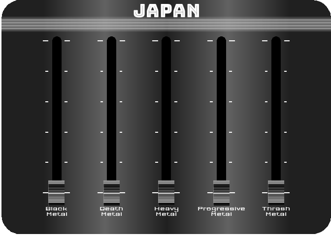
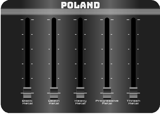
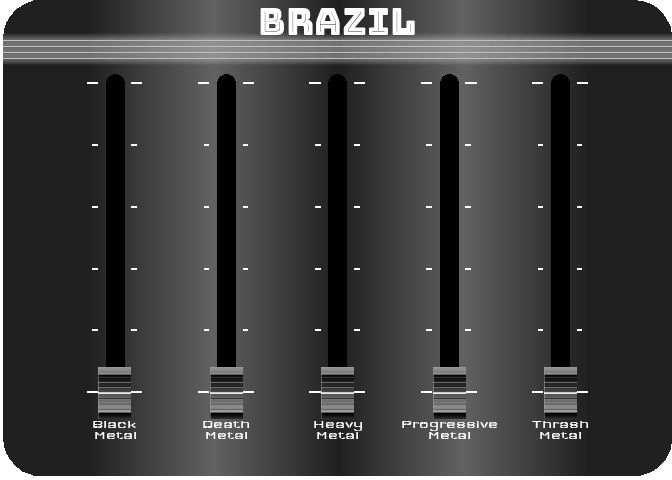
For the last figure, I wanted to try to create something with a nice design, customized, and animated. After thinking about it, I figured out that it would be interesting to turn a simple bar chart into a kind of animated equalizer. For this, I decided to represent the importance of the 5 most represented styles in 2021 (Black Metal, Death Metal, Thrash Metal, Heavy Metal and Progressive Metal) for four countries selected for their different style profiles (Japan, Poland, Brazil and the UK). For the design, I got my inspiration from this image.
To reproduce a similar background, I used a function (see functions/make_gradient.R in the source code of this post) inspired by the code of Kamil Slowikowski which generates nice color gradient. I also used the elementalist package to produce rounded panel backgrounds, the ggshadow package to generate glowing lines, and the ggimage and gganimate packages to use image as geom and generate animations, respectively.
I have wrapped the code in a function that generates an animated equalizer chart. The function (see functions/metal_equalizer.R in the source code of this post) requires the data loaded at the beginning of the post, the name of the country for which you want to generate the animated equalizer, a character vector with the styles you want to represent, and the year for which you are interested in seeing the importance of the indicated styles for the given country.
For practical reasons, I simply ran the functions separately for the four countries and saved each animated graph as a gif (you can unfold the chunk of code preceding the figure below for more details), before displaying them into a 2-by-2 grid. I have to admit that even though animation is not necessary here to understand the data, I am quite happy with the result and it looks really nice.
Show the code to generate the animated equalizer chart
showtext::showtext_auto()

anim_save(
  here("posts", "metal_viz", "eq_fig", "japan.gif"),
  animate(
    metal_equalizer(
      dat = dat,
      country = "Japan",
      year = 2021,
      styles =
        c(
          "Black Metal", "Death Metal", "Thrash Metal", "Heavy Metal",
          "Progressive Metal"
        )
    ),
    end_pause = 20,
    duration = 1,
    device = "png",
    renderer = gifski_renderer()
  )
)

anim_save(
  here("posts", "metal_viz", "eq_fig", "poland.gif"),
  animate(
    metal_equalizer(
      dat = dat,
      country = "Poland",
      year = 2021,
      styles =
        c(
          "Black Metal", "Death Metal", "Thrash Metal", "Heavy Metal",
          "Progressive Metal"
        )
    ),
    end_pause = 20,
    duration = 1,
    device = "png",
    renderer = gifski_renderer()
  )
)

anim_save(
  here("posts", "metal_viz", "eq_fig", "brazil.gif"),
  animate(
    metal_equalizer(
      dat = dat,
      country = "Brazil",
      year = 2021,
      styles =
        c(
          "Black Metal", "Death Metal", "Thrash Metal", "Heavy Metal",
          "Progressive Metal"
        )
    ),
    end_pause = 20,
    duration = 1,
    device = "png",
    renderer = gifski_renderer()
  )
)

anim_save(
  here("posts", "metal_viz", "eq_fig", "uk.gif"),
  animate(
    metal_equalizer(
      dat = dat,
      country = "United Kingdom",
      year = 2021,
      styles =
        c(
          "Black Metal", "Death Metal", "Thrash Metal", "Heavy Metal",
          "Progressive Metal"
        )
    ),
    end_pause = 20,
    duration = 1,
    device = "png",
    renderer = gifski_renderer()
  )
)

If you’ve followed me this far, I hope you’ve enjoyed this post and my attempt to explore new visualizations. I personally have learned a lot and I hope you have too!
#> - Session info ---------------------------------------------------------------
#>  setting  value
#>  version  R version 4.1.3 (2022-03-10)
#>  os       Windows 10 x64 (build 22000)
#>  system   x86_64, mingw32
#>  ui       RTerm
#>  language (EN)
#>  collate  French_Switzerland.1252
#>  ctype    French_Switzerland.1252
#>  tz       Europe/Berlin
#>  date     2022-12-29
#>  pandoc   2.18 @ C:/Program Files/RStudio/bin/quarto/bin/tools/ (via rmarkdown)
#>
#> - Packages -------------------------------------------------------------------
#>  package      * version    date (UTC) lib source
#>  cols4all     * 0.3        2022-08-03 [1] Github (mtennekes/cols4all@a0d3023)
#>  dplyr        * 1.0.9      2022-04-28 [1] CRAN (R 4.1.3)
#>  elementalist * 0.0.0.9000 2022-12-26 [1] Github (teunbrand/elementalist@2de3249)
#>  eurostat     * 3.7.10     2022-02-09 [1] CRAN (R 4.1.3)
#>  forcats      * 0.5.2      2022-08-19 [1] CRAN (R 4.1.3)
#>  gganimate    * 1.0.7      2020-10-15 [1] CRAN (R 4.0.3)
#>  ggbump       * 0.1.0      2020-04-24 [1] CRAN (R 4.1.3)
#>  ggflags      * 0.0.2      2022-12-29 [1] Github (jimjam-slam/ggflags@e3c6e51)
#>  ggimage      * 0.3.1      2022-04-25 [1] CRAN (R 4.1.3)
#>  ggiraph      * 0.8.5      2022-12-03 [1] CRAN (R 4.1.3)
#>  ggplot2      * 3.4.0      2022-11-04 [1] CRAN (R 4.1.3)
#>  ggshadow     * 0.0.5      2022-11-20 [1] CRAN (R 4.1.3)
#>  giscoR       * 0.3.2      2022-08-13 [1] CRAN (R 4.1.3)
#>  here         * 1.0.1      2020-12-13 [1] CRAN (R 4.0.5)
#>  lubridate    * 1.8.0      2021-10-07 [1] CRAN (R 4.0.5)
#>  purrr        * 0.3.4      2020-04-17 [1] CRAN (R 4.0.2)
#>  readr        * 2.1.2      2022-01-30 [1] CRAN (R 4.0.5)
#>  sf           * 1.0-7      2022-03-07 [1] CRAN (R 4.0.5)
#>  showtext     * 0.9-5      2022-02-09 [1] CRAN (R 4.0.5)
#>  showtextdb   * 3.0        2020-06-04 [1] CRAN (R 4.0.5)
#>  stringr      * 1.4.1      2022-08-20 [1] CRAN (R 4.1.3)
#>  sysfonts     * 0.8.5      2021-08-09 [1] CRAN (R 4.0.5)
#>  tibble       * 3.1.8      2022-07-22 [1] CRAN (R 4.1.3)
#>  tidyr        * 1.2.0      2022-02-01 [1] CRAN (R 4.0.5)
#>  tidyverse    * 1.3.2      2022-07-18 [1] CRAN (R 4.1.3)
#>
#>  [1] C:/Users/Simon Gorin/Documents/R/win-library/4.1
#>  [2] C:/Program Files/R/R-4.1.3/library
#>
#> ------------------------------------------------------------------------------
Reuse
Citation
@online{gorin2022,
  author = {Simon Gorin},
  title = {Exploring Visualizations with Metal Bands Data},
  date = {2022-12-29},
  url = {https://gorinsimon.github.io/metal_viz.html},
  langid = {en}
}